The Sidebar
The sidebar is the main method for navigating around your site.
You can minimise or expand the sidebar by clicking the chevron in the upper right.
Clicking on the Rapid logo in the upper left will return you to the site dashboard.
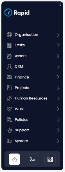
Along the sidebar are menu buttons. There are several things that a menu button can do:
- Menu buttons can act as Folders. Folders have a chevron to show they can be expanded. When a folder is clicked, it will display its contents.
- Menu buttons can also be links to specific pages in your Rapid site. These will not have a chevron.
Experience Buttons
At the bottom of the sidebar are three experience buttons. These buttons allow you to navigate to a different Rapid experience.
Explorer

- Allows you to view the data in your site
- Allows you to edit, add, or delete data
- Has an icon of a house to represent "home". This is because it is the experience you will use the most.
- You can read detailed documentation for Explorer in the Explorer User Manual
Workflow

- An advanced experience, that allows you to automate processes for your business
- An icon of a flowchart is used to represent the programming interface that Workflow uses.
- You can read the introductory documentation for Workflow in the Workflow User Manual
Designer

- Allows you to build the site that is visible in Explorer (e.g. new pages, new tables, new menu buttons, etc.)
- Has an icon of a ruler and a set square because it is used to design new data structures and interfaces for your site.
- You can read the introductory documentation for Designer in the Designer User Manual
Returning to the Dashboard
If you ever become lost while navigating through your site, you can click on the Rapid logo in the sidebar to return to the Explorer experience, and its Dashboard page.
As discussed, in this workshop we will be focused on understanding Explorer.